Let’s go to: Brazil
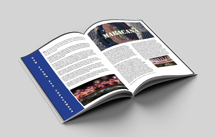
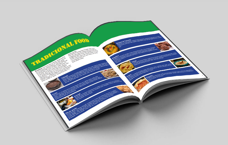
The “Let’s go to:” magazine stands out in the travel publishing market by offering a unique and memorable visual experience. The visual identity, based on the Brazilian flag, not only pays homage to the country but also creates a strong and cohesive brand. Through strategic and intuitive design, the magazine guides the reader on a journey of discovery, presenting relevant information and curious facts in a clear and engaging way.
Select Color Pallete:

Green
(#0E9C49)
RGB: 14 / 156 / 73
CMYK: 84 / 12 / 100 / 2

Yellow
(FEBF00)
RGB: 254 / 223 / 0
CMYK: 2 / 88 / 99 /0

Blue
(25408F)
RGB: 34 / 64 / 143
CMYK: 100 / 90 / 10 / 0
Typography
Title – Stencil (regular)
Text – Bahnschrift (regular)
Quotes – Segoe Print (regular)