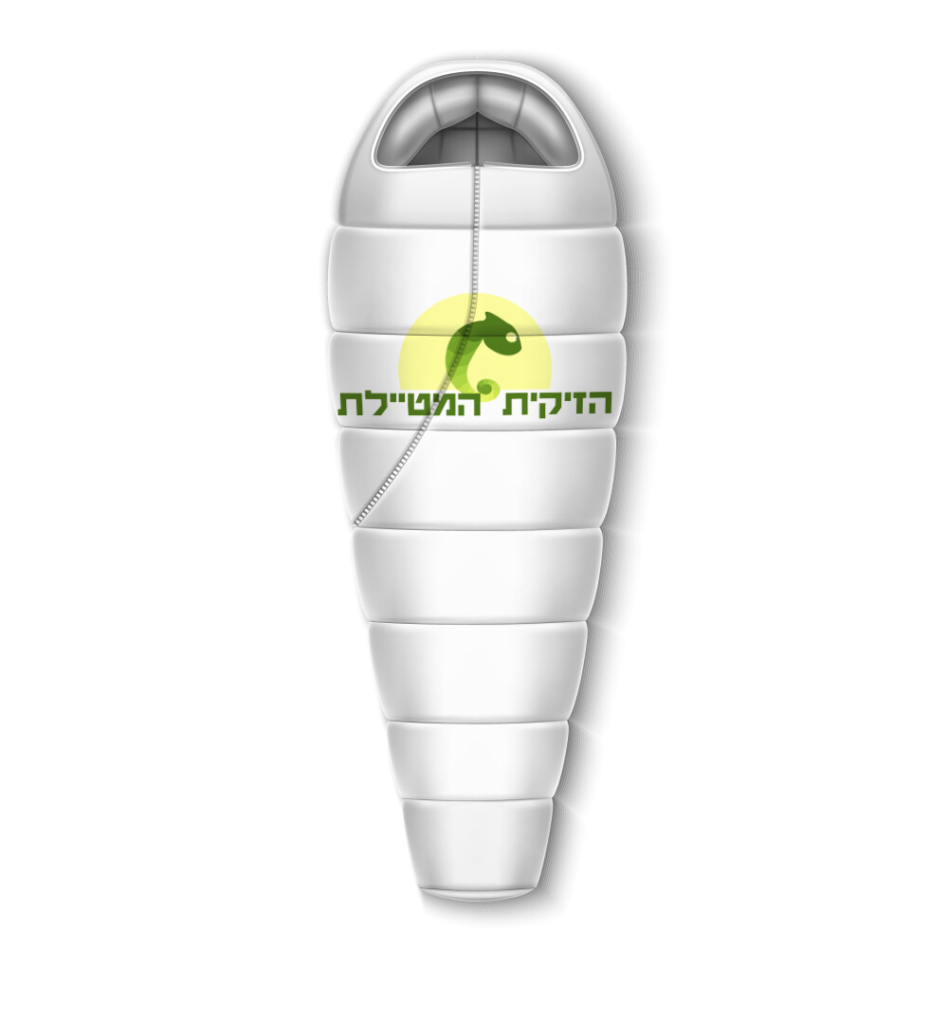
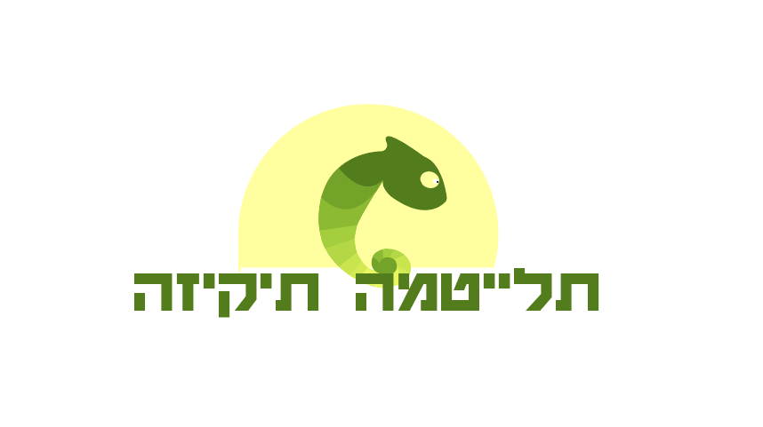
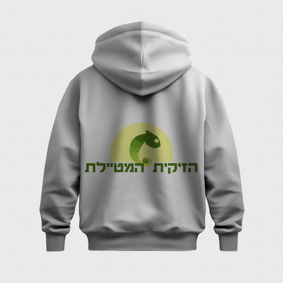
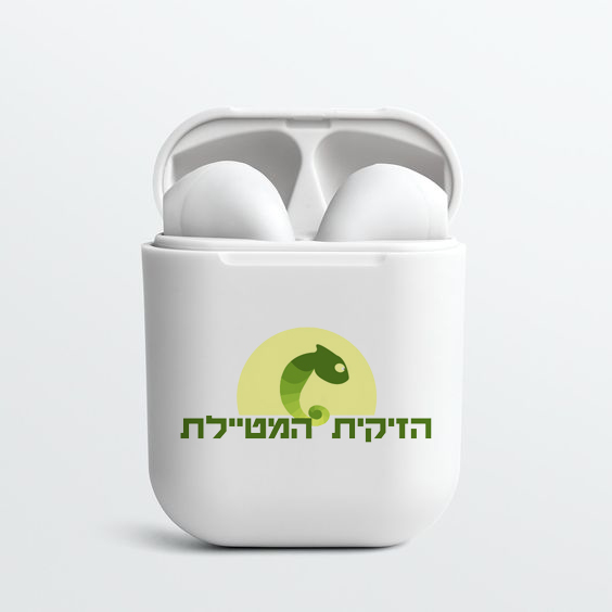
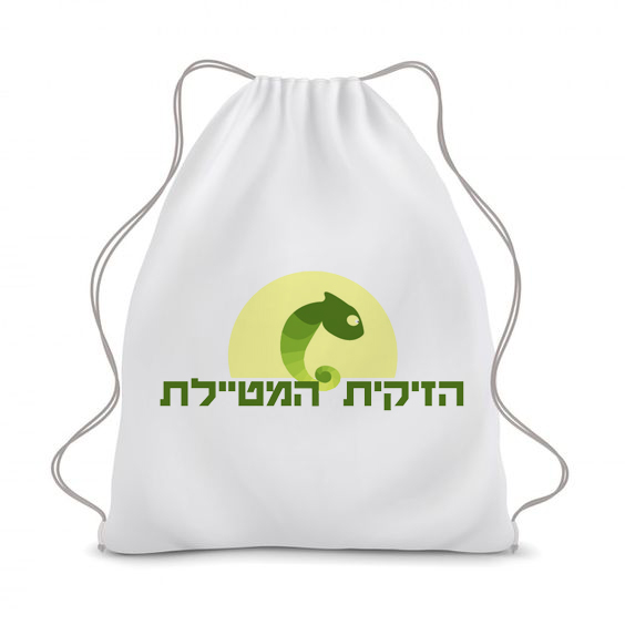
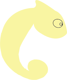
Chameleon: Travel Agency
The challenge was to create a visual identity that captured the essence of Chameleon: a travel agency that connects people with nature. The solution was a logo featuring a chameleon blending into the colors of the sunrise, symbolizing the brand’s adaptability and versatility. The clean and minimalist design, combined with a nature-inspired color palette, creates a striking and memorable visual identity.


Select Colors Pallete:

(#537c1d)
RGB: 83 / 124 / 29
CMYK: 71 / 31 / 100 / 16

(#74a329)
RGB: 116/ 163 / 41
CMYK: 61 / 17 / 100 / 2

(#8cba32)
RGB: 140/ 186 / 50
CMYK: 51 / 7 / 100 / 0

(#a4ce3e)
RGB: 164 / 206 / 62
CMYK: 41 / 0 / 98 / 0

(#b4d845)
RGB: 180 / 216 / 69
CMYK: 34 / 0 / 91 / 0

(#c8e54e)
RGB: 200 / 229 / 78
CMYK: 26 / 0 / 84 / 0

(#e8f75e)
RGB: 232 / 247 / 94
CMYK: 13 / 0 / 76 / 0

(#ecf96e)
RGB: 236 / 246 / 110
CMYK: 11 / 0 / 69 / 0
(#ffff9f)
RGB: 255 / 255 / 159
CMYK: 3 / 0 / 46 / 0
Typography:
Guttman Haim (Regular)