KiddoRide
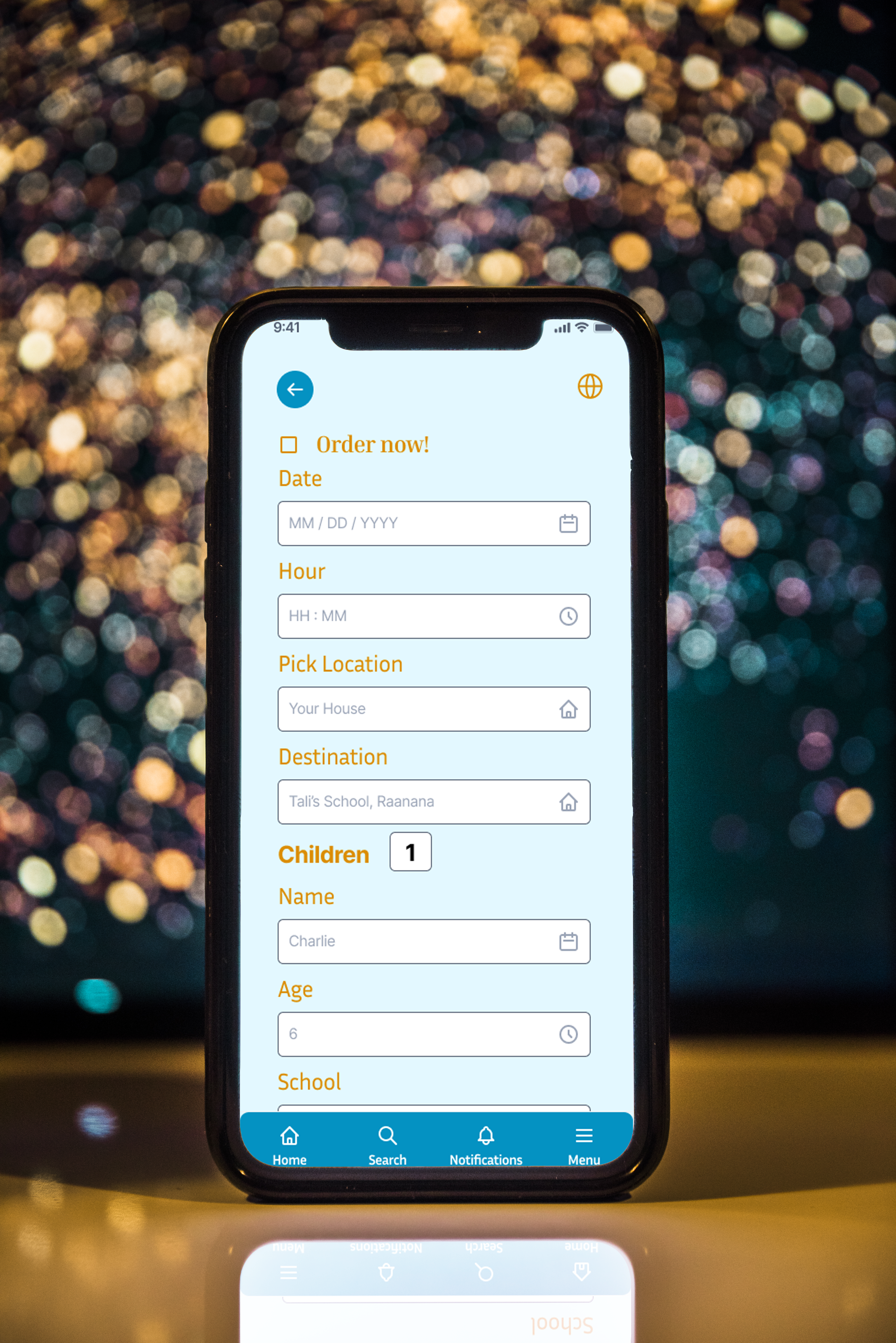
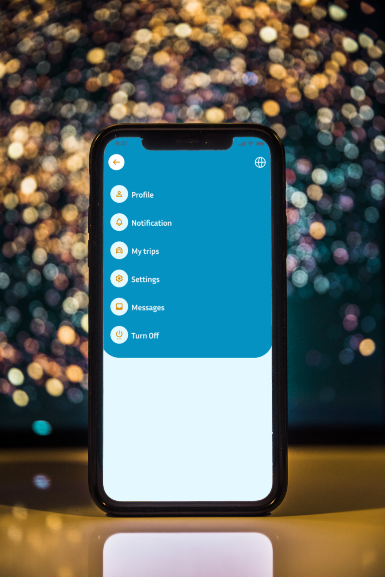
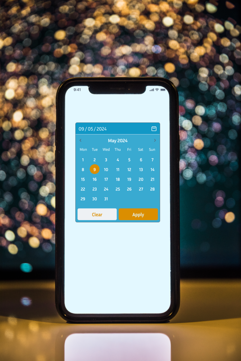
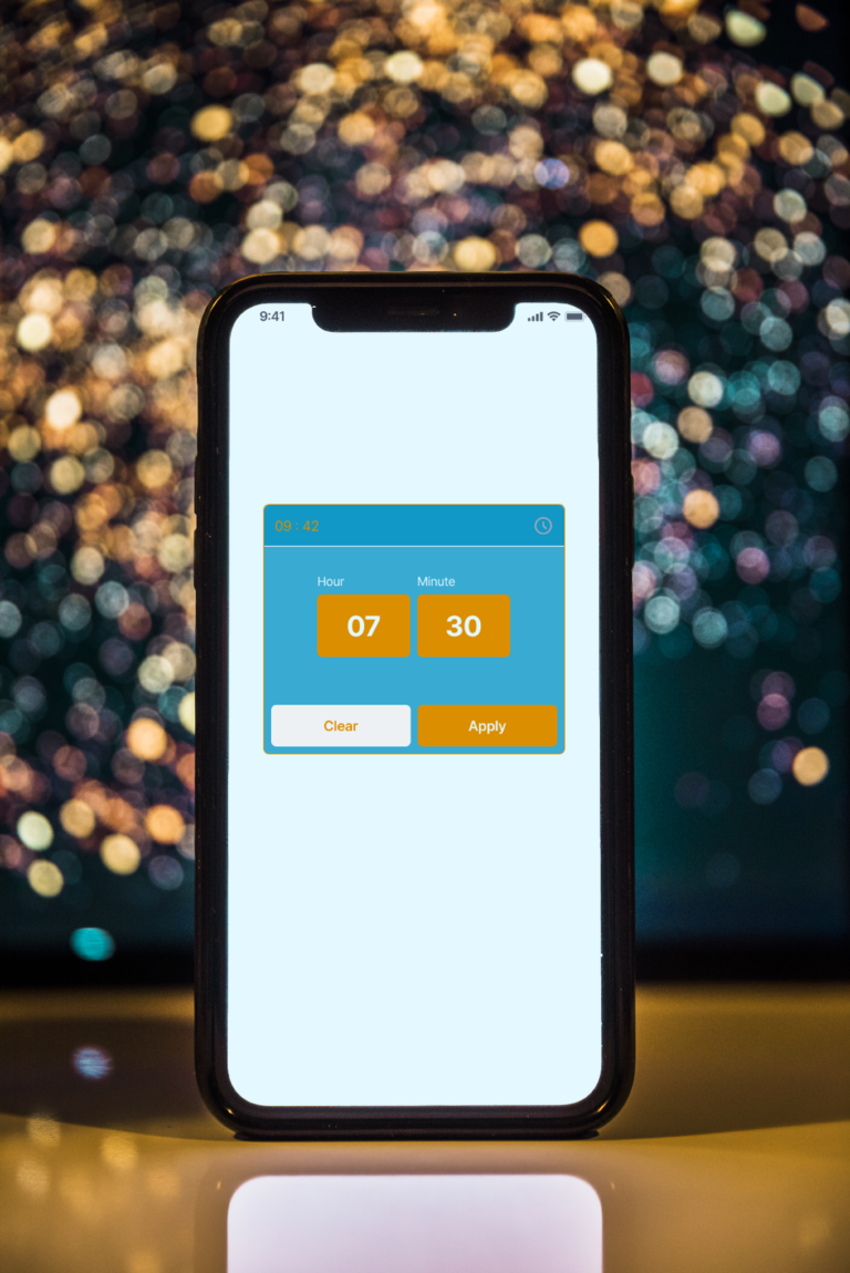
KiddoRide was conceived to address the challenges parents face when arranging school transportation. By employing a user-centric design approach, I uncovered the specific pain points experienced by parents and crafted an app that delivers an intuitive and tailored experience. The app’s sleek and modern design ensures easy navigation, making it accessible to all parents. Key features of KiddoRide include:
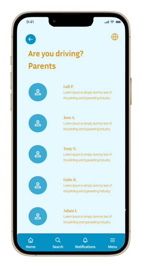
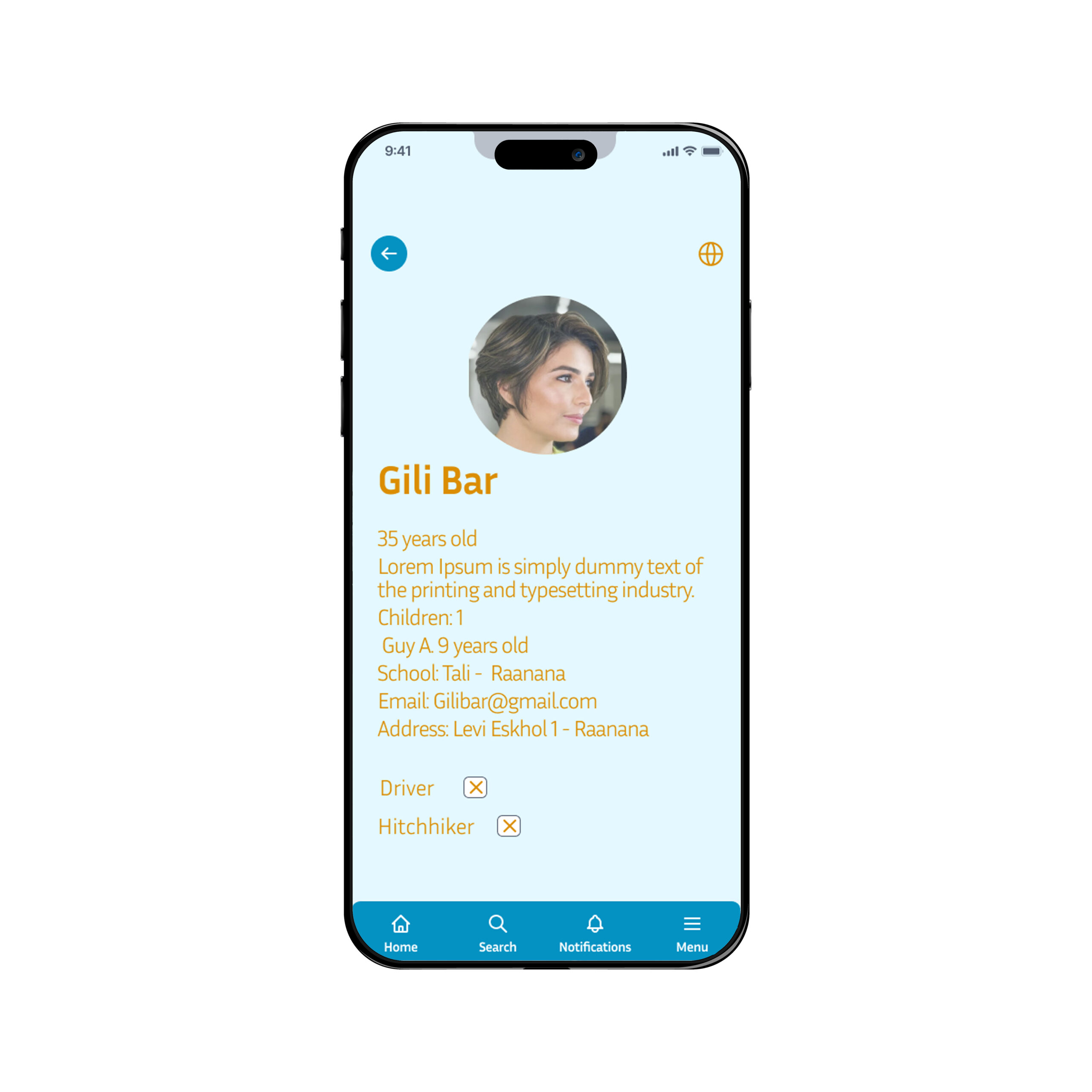
- Safety profile: Prioritizing user safety, the app implements a robust identity verification and history system.
- In-app chat: Fostering trust, parents can communicate directly with drivers before each trip.
- Personalized routes: Parents can select the most convenient route for their children.
The goal behind KiddoRide was to create an app that not only addresses a practical need but also enhances the overall user experience.


Selected color palette:
Vibrant Orange
(#d98f28)
RBG: 217 / 146 / 194
CMYK: 13 / 48 / 100 / 1
Pacific Blue
(#0492c2)
RBG: 217 / 146 / 194
CMYK: 13 / 48 / 100 / 1
Light Blue
(#add8e6)
RBG: 217 / 146 / 194
CMYK: 13 / 48 / 100 / 1
Sky Blue
(#e3f8ff)
RBG: 227 / 248 / 255
CMYK: 9 / 0 / 0 / 0
Bright orange
(#db8e00)
RBG: 219 / 142 / 0
CMYK: 13 / 48 / 100 / 1
Typography
Logo: Berlin Sans FB Demi Bold (Bold)
Title and Button: Inter Sans (Bold)
Text: Inter Sans (regular)