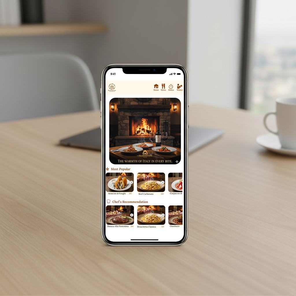
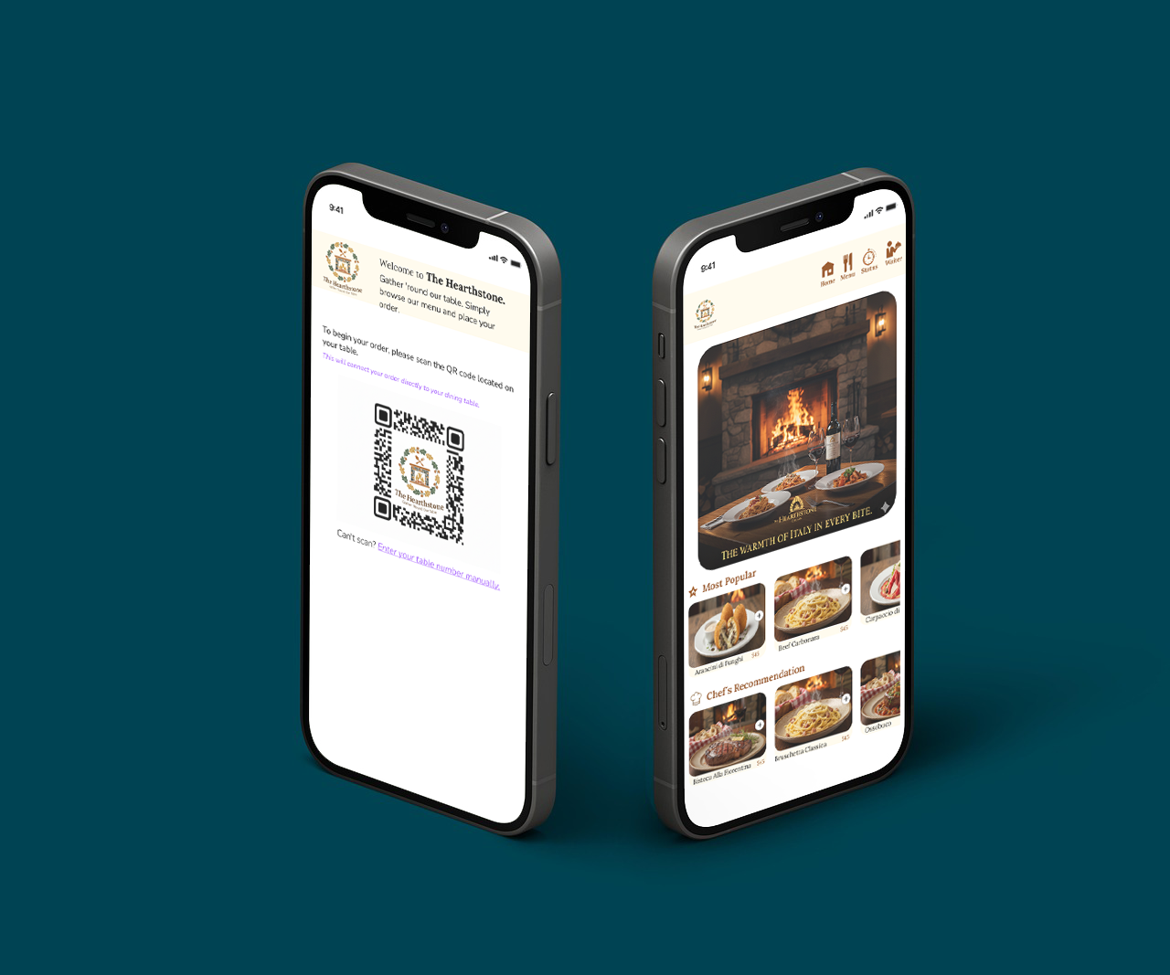
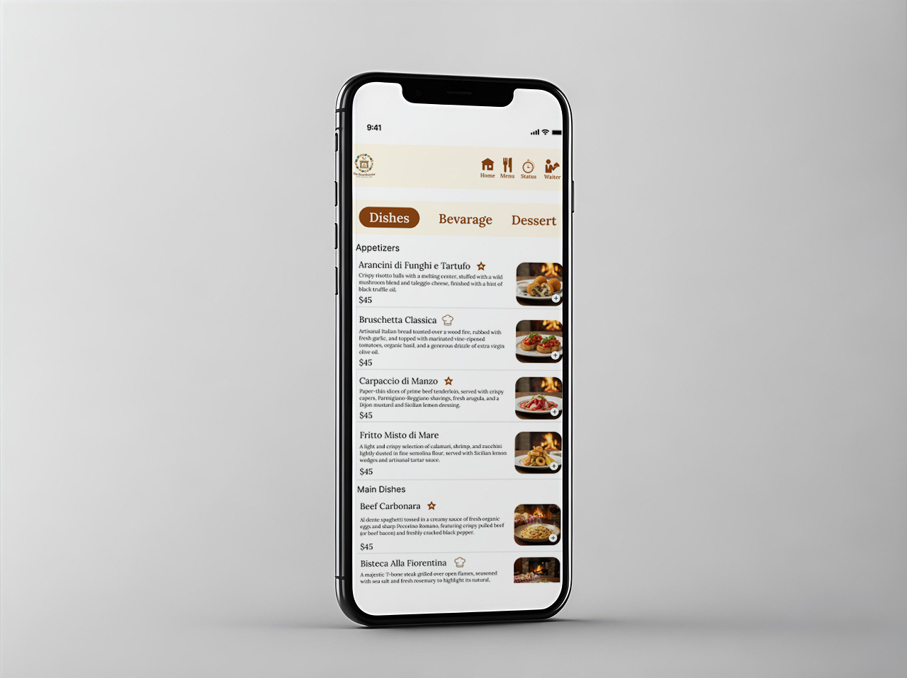
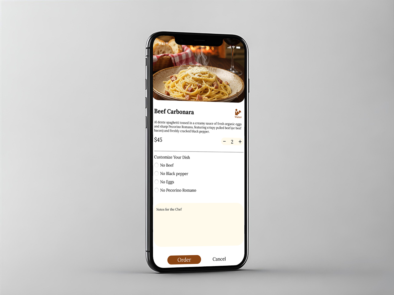
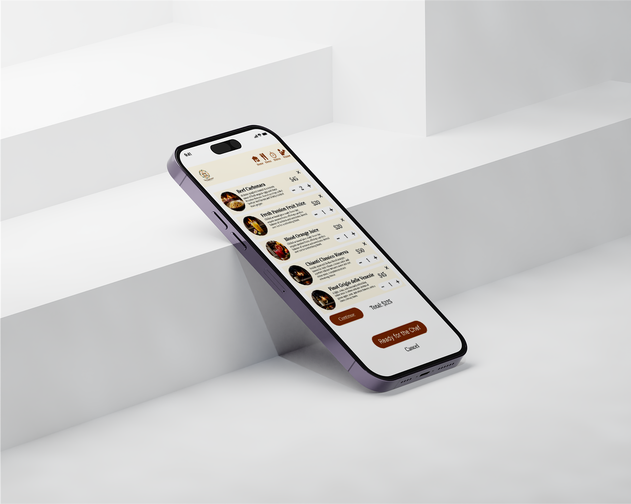
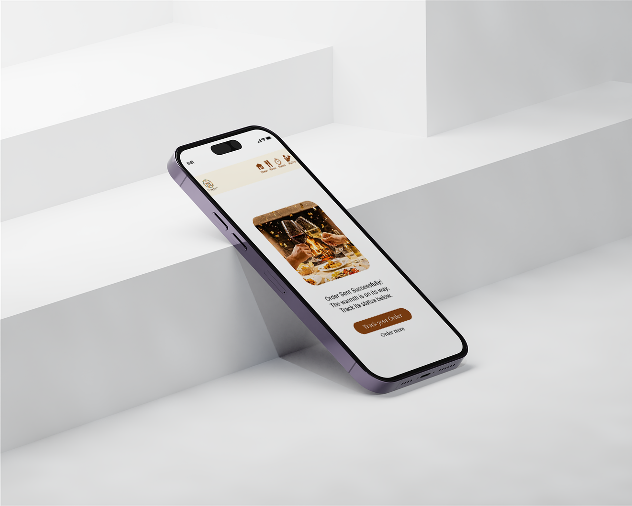
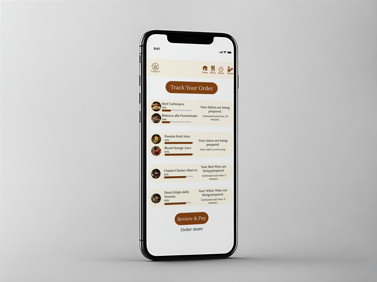
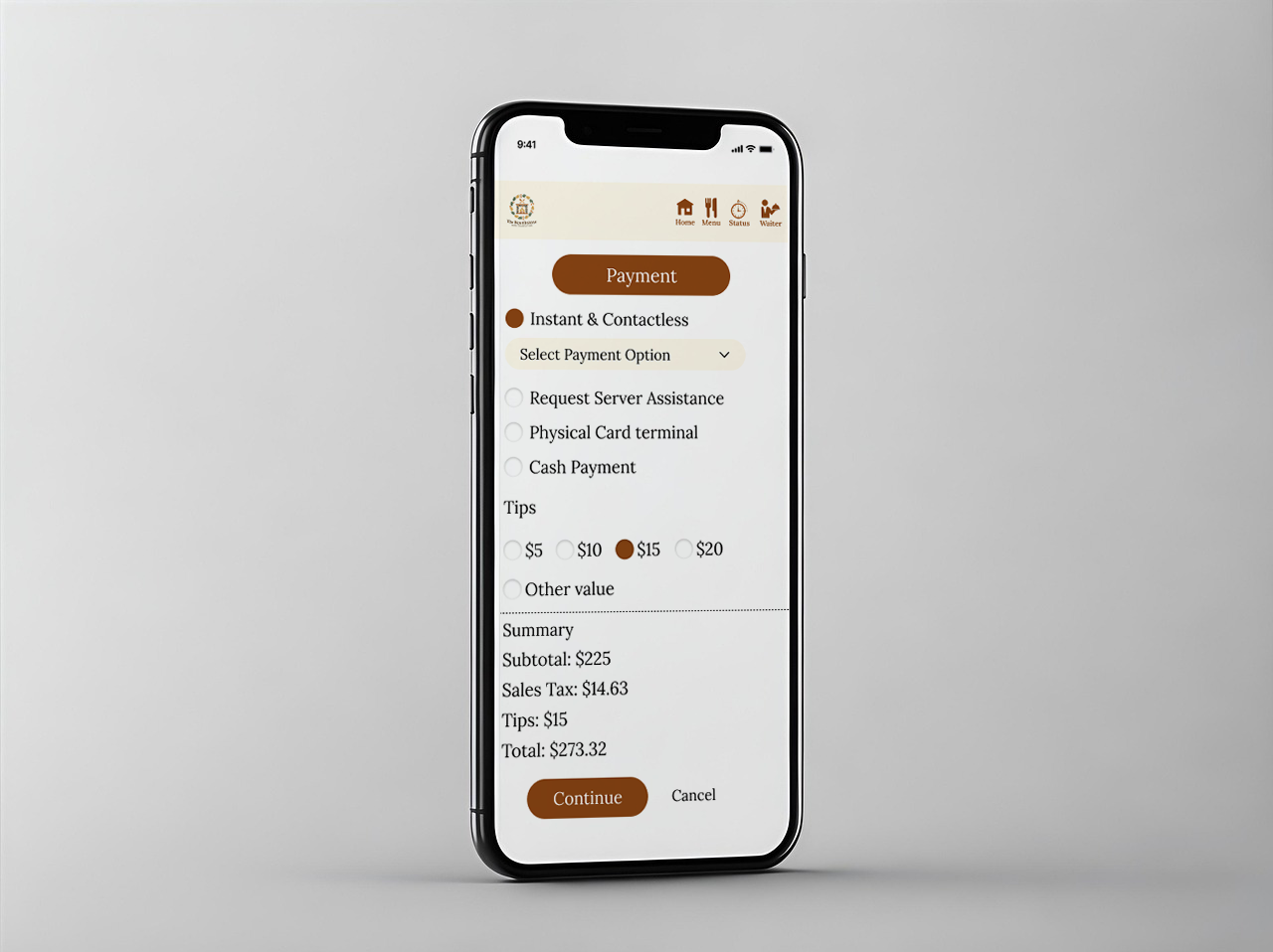
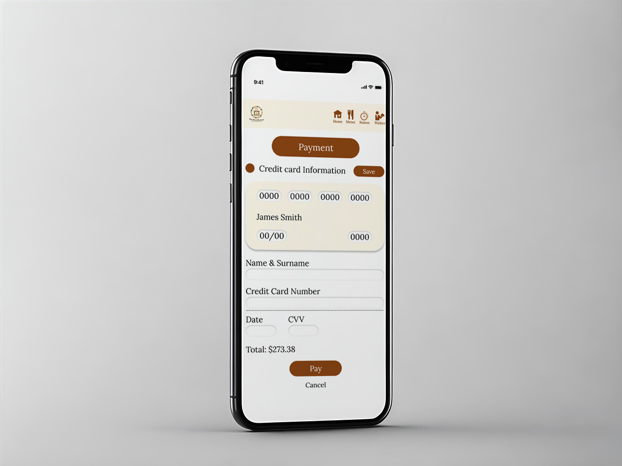
The main obstacle in food service applications is the high level of user friction during the ordering process, often caused by cluttered menus and confusing navigation. The challenge was to design a mobile experience that simplifies the journey from browsing to checkout, ensuring that the interface remains clean while showcasing high-quality food photography and essential restaurant information.
Solution
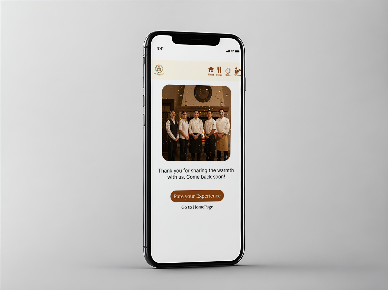
I developed a streamlined interface that prioritizes visual appeal and speed, utilizing a grid-based menu system for effortless browsing. The solution focuses on an intuitive checkout flow and clear call-to-action buttons, reducing the number of steps required to complete an order. By implementing a warm, appetizing color palette and a clean hierarchy of information, the design creates a professional yet inviting atmosphere that enhances the user’s appetite and overall confidence in the service.